Image Optimization II
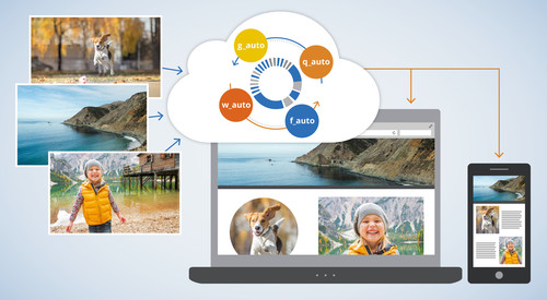
Every image is unique and every one of your website visitors is different. In a perfect world, we'd like to adapt each image individually to be "just right" for every user. With "just right" being perfectly cropped, using responsive dimensions, correct encoding settings and optimal quality with the best image format.
Here’s a quick example using a photo of a (...drum roll...) cat:

Now, we need to adapt the image to fit the graphic design on every device and browser. The image should look great in any resolution and website layout and it should be delivered optimized to improve website performance.



The image on the left is a standard crop and is delivered as a standard JPEG of the original 2000px image height, resulting in a large 537KB file. However, the image on the right is perfectly cropped, scaled down to 300px wide and delivered as an optimized 17KB WebP image on Chrome (saving 97% of bandwidth).
Optimal delivery on an image-by-image and user-by-user basis is quite challenging. It requires a considerable know-how on the intricacies of file formats, vision algorithms and browser support. This challenge gets even more complicated when you want to scale up to hundreds of thousands if not hundreds of millions of images that may be uploaded to your websites and mobile apps.
So how is this achieved, and how can you automatically apply it to your own website and mobile apps?
Images solved
When we launched the Cloudinary service more than 4 years ago, we wanted to eliminate the R&D time involved in managing the images of web and mobile applications. The service that was written by developers for developers, and was designed to be a complete solution for all their image needs. Today we are excited to introduce a major milestone in making our vision a reality by reaching the state of Images solved.
Developers want to create the perfect image crop focusing on the most important region. Developers need to determine the optimal file format and encoder settings for every image, to perfectly represent the content with the minimum number of bytes, for a fast and fluid user experience. Developers need to create multiple variants of every image for responsive delivery on various devices and in different resolutions.
Every image is unique in its content, and every visitor to your website has a different device, resolution, browser and network speed. It is challenging to deliver an optimal image to every user, especially when you need to scale that up to hundreds, thousands or millions of images.
The "Images Solved" solution introduced here, takes Cloudinary's cloud-based image management solution to the next level using automatic content-aware and context-aware image adaptation.
The concept is to let users upload one high resolution copy of any image and then automatically adapt the image, in real-time, to focus on the most important region of the image, select the optimal quality and encoding settings and responsively deliver the image to any device in any resolution or pixel density. We wanted to simplify the life of a developer further, by automating the following critical image manipulation and delivery components:
Automatic content-aware cropping -
g_autoIntelligent content-aware encoding -
q_autoDynamic format selection -
f_autoAutomatic responsive images -
w_autoanddpr_auto
Automatic content-aware cropping - 'g_auto'
For any website design, and specifically any responsive design, simply scaling an image up or down isn't always enough - images often require cropping to fit diverse device layouts, resolutions and aspect ratios while maximizing the visibility of important areas within the image.
Manually cropping individual images to fit them on various resolutions is resource intensive and quite impossible if your web application includes massive user generated content and a dynamic responsive layout.
Cropping all images to focus on the center of the image, by default, can result in a loss of important content.
Cloudinary already supports face detection to perfectly crop a photo, but what if you want to focus on more than just the face or if the image subject is a product, a food item or a pet?
The Cloudinary content-aware cropping algorithm uses a combination of heuristics to automatically detect the region of interest in every image and then crop them on the fly (using dynamic URLs) to fit the graphic design and layout of your site when viewed on any device, and without losing focus on important content.
For example, the following photo was uploaded to the cloud:

Now we need to adapt this image to fit in three different pages on a website: in landscape (e.g., 800x200), in portrait (e.g., 300x600) and as a square (e.g., 300x300). As you can see below, standard center cropping brings problematic results, as most of the cat is left out.



Setting the gravity image cropping parameter to auto or using g_auto in the following on-the-fly image manipulation URL, generates the optimal cropping result, ensuring that the cat is always included.




</div> </div>
The images above used the popular fill crop mode, which tries to keep as much of the original image while cropping. However, sometimes websites prefer to display a more zoomed-in thumbnail emphasizing the person or object in the original image. For example, take a look at the following uploaded images:


For example, let's create a 300x270 thumbnail of each of the original images. The following images are dynamically created in the cloud using automatic face detection by setting gravity to face (g_face).



The results above are nice, but they are not optimal thumbnails for the original photos. We see more of the blurry sofa instead of the nice cat, it's hard to see that there's a dog next to the lady, and no one will know that a red bike was in the original image.
Cloudinary's automatic cropping algorithm in the thumbnail generation mode focuses on the area of interest - not only on facial close ups - intelligently analyzing the image content. The thumbnails below are created by setting the crop mode to thumb and the gravity to auto (c_thumb,g_auto). These thumbnails effectively reflect the story behind each photo.



Try out the automatic cropping interactive demo page and see the 'Automatic cropping' documentation for more details.
Intelligent content-aware encoding - 'q_auto'
Developers and designers tend to refrain from experimenting with image quality adjustments for fear of degrading the visual quality. However, adjusting the quality compression level doesn’t always lead to a loss of visual quality. In fact, precise adjustment of the compression level complemented by fine tuning of the encoding settings can significantly reduce the file size without any degradation noticeable to the human eye. So, what’s the standard quality setting that works for all images? Unfortunately, there is no single setting that is optimal for all images because it depends on a combination of the compression algorithm, the image format and the actual image content.
Cloudinary automates the file size versus quality trade-off decision, on the fly, by using perceptual metrics and heuristics that tune the encoding settings and select the appropriate image format based on the specific image content and format.
The intelligent encoding algorithm analyzes every image to find the best quality compression level and the optimal encoding settings based on the image content and the viewing browser, in order to produce a perceptually fine image while minimizing the file size.
For example, the following 500px wide image was encoded as a JPEG with a quality of 90 (without chroma subsampling). The image looks quite good and weighs 58.3KB.

Developers who want to optimize performance and save file size, might select a more aggressive compression quality level. However, as you can see below the resulting image might have disturbing artifacts, while the file size is smaller and weighs 24KB.

Now, setting the quality manipulation parameter to auto (q_auto) tells Cloudinary to analyze the image and find the optimal image encoding settings and compression quality level. The resulting image looks quite good and weighs only 39.6KB, which means a saving of 32% over a standard 90 quality encoded image.

The significance of the performance optimization depends on the content of every individual image. For example, the following image weighs 63.7KB using regular JPEG encoding with a quality of 90, and only 25.1KB (a 61% saving) with quality set to auto, while still looking great.


Furthermore, when a user enables data saving mode, the browser sends the Save-Data: on Client Hint request header, and Cloudinary automatically switches to a more aggressive automatic quality level and encoding settings selection.
Try out the automatic quality interactive demo page and see the Automatic quality and encoding settings documentation for more details.
Dynamic format selection - 'f_auto'
Developers are expected to select optimal image formats for different scenarios based on the image content and the viewing device/browser. For example, JPEG should be used for a captured photograph or for faster loading while PNG should be used for illustrations or drawings or when using a transparent background. Additional logic should also be considered for modern formats such as WebP and JPEG-XR, if the viewing browser is Chrome or Internet-Explorer/Edge.
Image formats can have a significant impact on the page load time and bandwidth - for example using WebP over JPEG can result in a 30% file size reduction, which can lead to faster page loads resulting in improved site engagement and conversion rates.
The browser and format compatibility requirements seem simple, but manually adopting the format logic for many images can be complex and inefficient.
To optimize image delivery, Cloudinary can dynamically select the most efficient format, based on the content and viewing browser, and convert the image to that format on the fly. For example, it automatically delivers images as WebP to Chrome or JPEG-XR to Internet Explorer or Edge. No more manual conversion of images to the most efficient formats.
Transparent WebP delivery and JPEG-XR delivery were introduced a couple of years ago. Now, you can combine automatic format selection with automatic image encoding and quality selection. For example, the same image as above with q_auto,f_auto will be encoded as WebP for Chrome users, consuming only 16.2KB and still look great. Users of Internet-Explorer/Edge will get a JPEG-XR and users of other browsers will get a JPEG.

The combination of q_auto and f_auto is even more powerful together than either of them separately. The algorithm might detect that the PNG format (or the lossless WebP format) is a better fit for specific images that contain content such as drawings. For some images, even the PNG8 format can be automatically selected for providing great looking results with a very efficient file size.
For example, the following URL dynamically generates a 500px wide version of a drawing using automatic image encoding and quality selection (q_auto without f_auto).

The result is a JPEG image that weighs 41KB. If you look carefully, you will see that the lossy nature of JPEG resulted in some unpleasant artifacts. Now, let's tell Cloudinary to combine both q_auto and f_auto. The result is shown below. The algorithm decided to encode the image using the PNG8 format. The image looks better, has no artifacts (the only artifacts are from the original high-quality JPEG image), and weighs even less - just 34.8KB.

See Automatic format selection documentation page for more details.
Automatic responsive images - 'w_auto' and 'dpr_auto'
To implement responsive design, developers need to create multiple versions of every image to make it look perfect on any device, in any resolution, pixel density or orientation.
Generating, managing, marking-up, and delivering these numerous image versions can be a daunting task. Cloudinary simplifies dynamic image delivery for responsive websites on Retina and regular displays by automating the image width and DPR value decision based on the viewing device, display size and layout.
Using Google's Client Hints, Cloudinary determines the required width of an image based on the browser's viewport-width or the layout width, and then calculates the optimal resolution for displaying the image on that device. Furthermore, Cloudinary can dynamically select image-specific breakpoints by determining the required number of versions of every image in order to balance the optimal dimensions vs. bandwidth reduction trade-off.
This means that developers simply need to have a single high resolution version of every image. Cloudinary automatically adapts the image to fit the viewport, layout and resolution on any device using a single dynamic URL - ensuring a visually seamless user experience while improving performance.
Generating images of different width and DPR values via the same dynamic URL is done by setting the width and dpr manipulation parameters to auto (dpr_auto,w_auto). The Client Hints request headers are automatically processed to retrieve the best fitting image dimensions.
For example, the following URL first crops an image to a 16:9 aspect ratio and requests automatic DPR and width delivery. The device's DPR is rounded up to an integer value (1.0, 2.0, 3.0, etc.) and the actual required width value is rounded up to the closest multiple of 100 pixels (by default). The example below also limits the delivered image to 2000px wide in case that the Client Hints are not available.
The following URL simulates the Client Hints header, specifying a fallback width of 387 pixels, which is used in the case that the Client Hint header is not available. In this case, the generated image is rounded up to 400 pixels wide, which weighs only 29.9KB compared to the 414KB of the the maximum 2000px wide image.

One image for all screen resolutions and different devices is not enough. An image for every pixel change in width is too much, while an image for every 100 pixels difference might be an arbitrary threshold - so how can someone automatically choose the optimal responsive image sizes?
Fortunately, Cloudinary's new automatic responsive images solution now supports dynamic generation of optimal breakpoints for each individual image on-the-fly. Here's an example of a URL that calculates and returns the optimal breakpoints as shown below.
Responsive breakpoints generation using JSON
The breakpoints are seamlessly used behind the scenes, so a single URL like the following one will return an image with a width equal to the breakpoint closest to the required display dimensions. For example, if the required width is 387px, an image that is 507 pixels wide will be dynamically generated in the cloud and delivered to users.

Client Hints are currently only supported by the Chrome, Opera and Android browsers, and they require adding a meta header to your HTML page for enabling their usage. For other browsers, you may want to specify a fallback width value to resize the image.
See a live sample page of Automatic Responsive Images With Client Hints and the Automatic responsive images documentation page for more details.
Going forward
We believe that the four image automation capabilities that were introduced here are extremely useful for any web developer. From my personal experience, once you start using the new features, you will probably find it hard to recall what you did beforehand.
More than 120,000 developers have signed up to Cloudinary and over 3,000 of them are active paying customers. Our vision is to answer all their image (and video) related needs, and we believe that the new automatic algorithms are a big step towards realizing this vision.
Automatic algorithms, as intelligent as they can be, are not always perfect and the quality of the result might be subjective. Therefore, Cloudinary supports a manual override via the API or the UI: override automatic cropping by specifying custom coordinates for the image, and override the automatically selected quality level by specifying a custom level. The manual overriding actions are also used as feedback for our algorithms, allowing us to further enhance and fine tune the algorithms until as many images as possible are solved.
In our upcoming posts, we’ll share more in-depth details about each of our new automation capabilities. Stay tuned, and as always, we would appreciate your feedback. Try it out?
All image manipulation and delivery features introduced here are now available with no extra charge for all Cloudinary's plans , including the free plan.
Notes:
The responsive breakpoints support (
w_auto:breakpoints) currently requires a custom domain name (CNAME) or a private CDN distribution, which are available for Cloudinary's Advanced plan and above. This feature might also involve certain additional costs.For customers with a custom domain name or private CDN distribution, the features that involve Client-Hints processing (
w_autoandq_autowithSave-Datasupport) need to be set up. Contact us for more details. UPDATE - September 2016: features that involve Client-Hints processing are now available for all customers without the need for a specific setup.
Last updated