Build a Cover Image
In this example we'll take a performance image and create a cover image. Here we have the amazing Jazz artist, Wayne Shorter - image copyright and courtesy of Capitol Music Group.
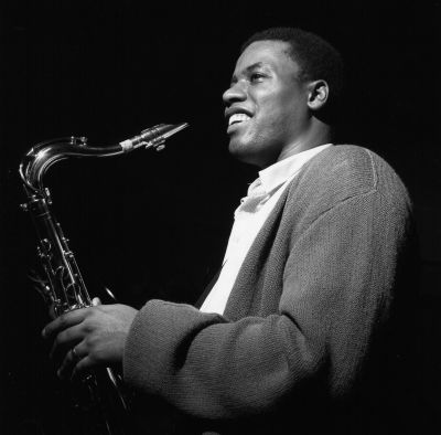
Beautifully cropped square image, but to make it a cover image we need the image to fit into a 16:9 aspect ratio. We will need to pad the image to make up the image fit into the new aspect ratio. First step is to example the direction the performer's eyes are gazing. Wayne is looking to the left so let's add lead space and pad the image to the left.
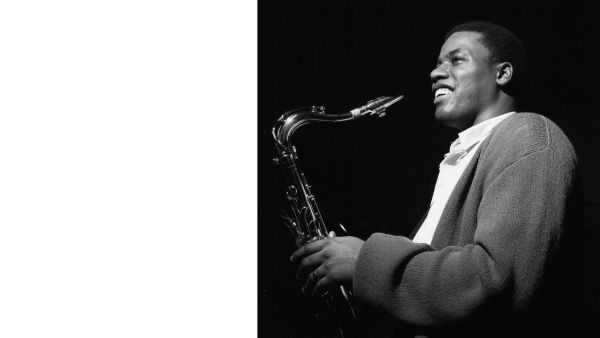
We added aspect ratio of 16:9, cropping of lpad and gravity east to create the image and move it to the right. This done simply by adding the params into the url as follows:
Nice but would it be better if the background color matched the exact same color as the backgound in our original? Easy! Just add background auto to our url:

Looking good! Now lets optimize this for performance and quality.

We can optimize the dpi, format, and quality with a few additional params in our url:
The addition of these params will improve performance and delivery of the final image tremendously, In general you should always use them.
You'll notice we also added a width param: w_1600 - You'd set this to fit the image into a explicit layout size, if you omit it you'll get the original image size. The example here were set at a width of 600 to fit nicely in the layout.
Our cover image allready looks awesome, but let add a artistic filter to enhance the black and white image. Adding the effect param with a named filter is how we do it.

Nice vibe! You can almost hear Wayne's smooth jazz sounds. We have dozens of artistic filters, text and image overlays to experiment with and make that cover image pop.
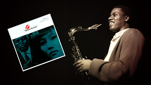
Add some text:
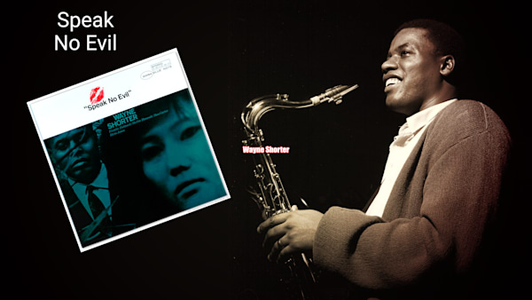
Variations
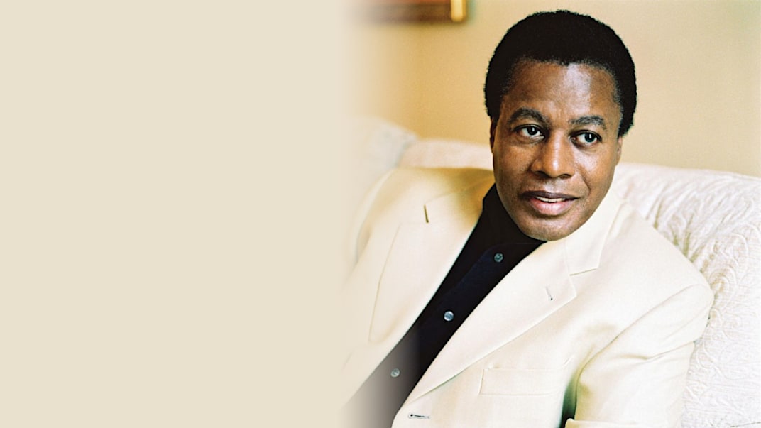
This variation pulls in the background color and eases in the transition with gradient fade:
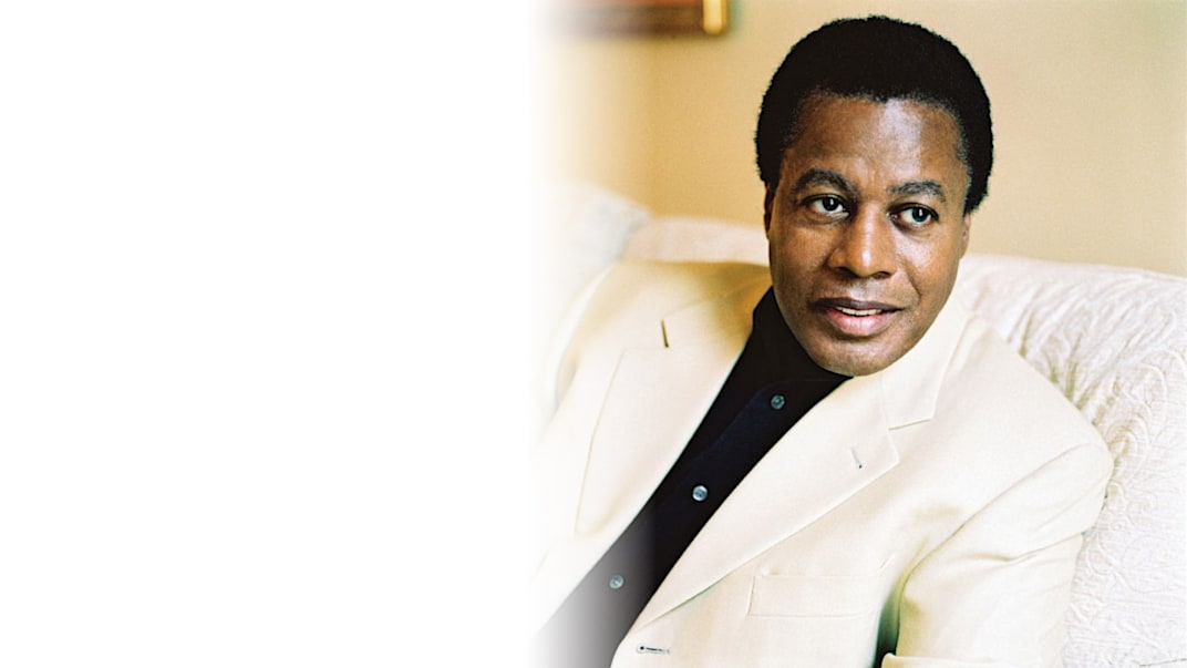
Here we use the gradient fade to transition the background to white:
You can also have the that gradient fade into transparency to reveal the background; remember to change the format extension to png.
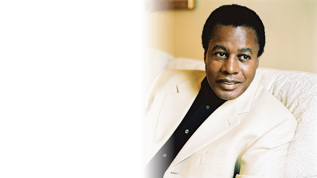
Now see how this technique might look on a web page with an interesting background:

Last updated